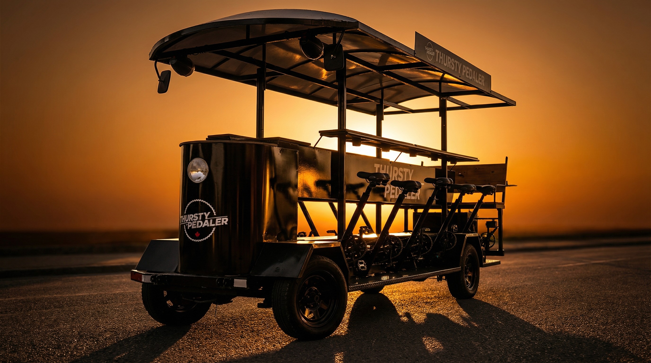
To build a distinctive, ownable brand that drives recognition and recall within Ottawa’s tourism market, using a playful naming strategy and versatile visual system designed to increase visibility, engagement, and partnership opportunities across physical, digital, and experiential touchpoints.