Quinn Ayling Realty
Client:
Quinn Ayling
Project Details
Owner
Services
Quinn Ayling's real estate brand combines modern sophistication with approachable warmth, integrating RE/MAX's trusted heritage while establishing a distinct personal presence through thoughtful design.
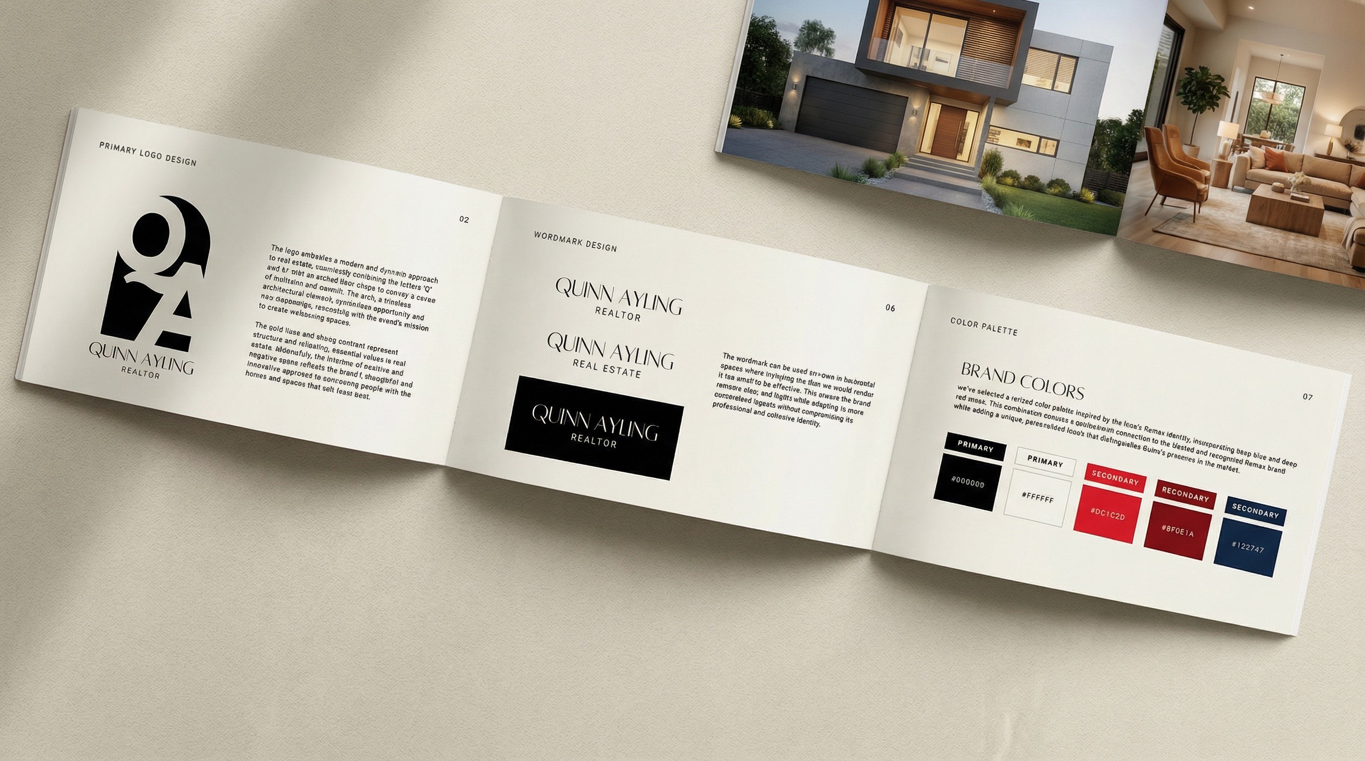
To position Quinn Ayling as a trusted, innovative real estate professional who conveys opportunity and welcoming spaces while maintaining RE/MAX's professional standards and attracting clients seeking a personalized, modern experience.
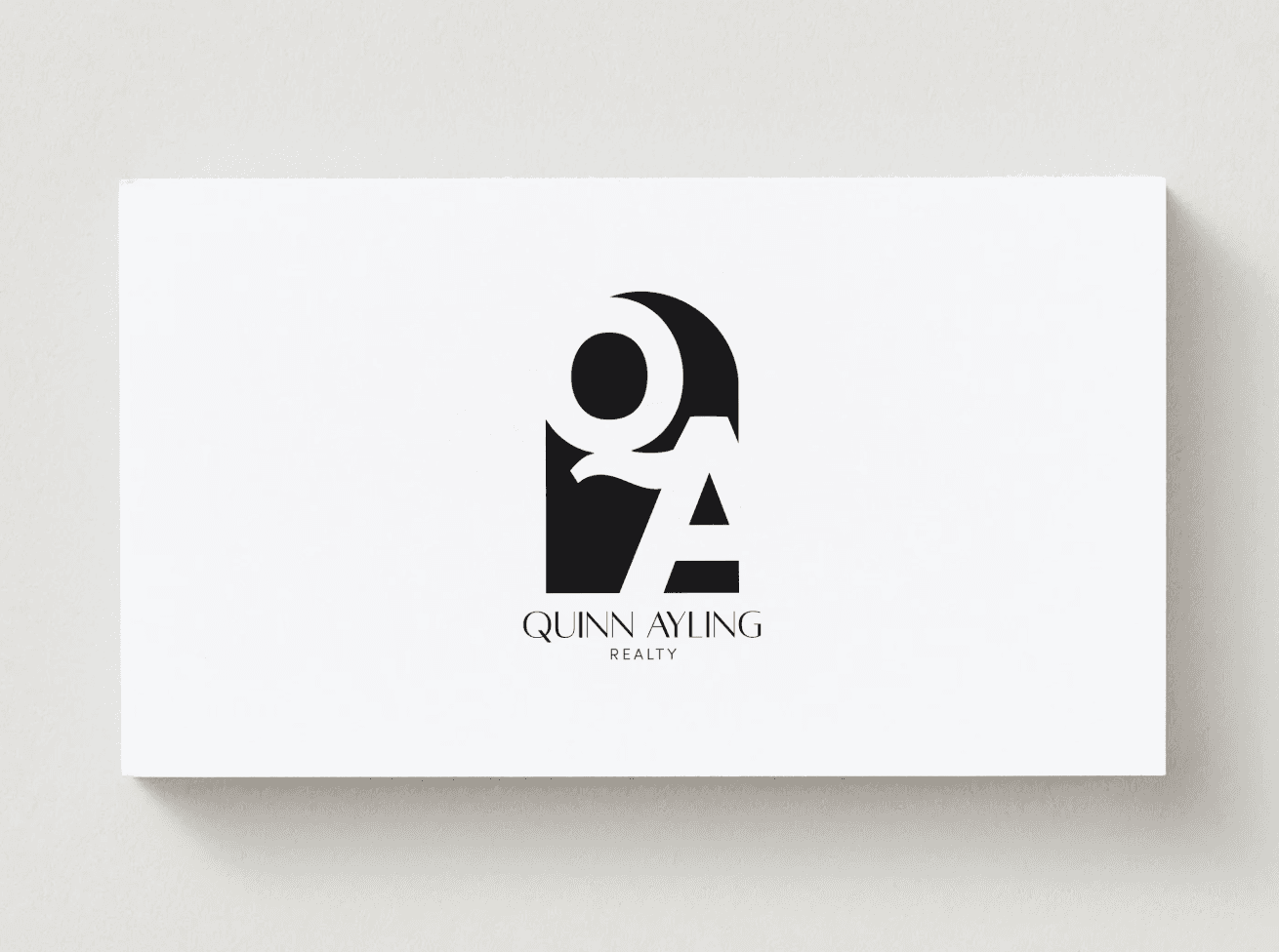
The brand centers on a distinctive logo merging 'Q' and 'A' with an architectural arch symbolizing doorways and opportunity. The color palette draws from RE/MAX's iconic deep blue (#122747) and reds (#DC1C2D, #8F0E1A) for alignment with differentiation. Typography pairs Alta's bold headlines with Inter's clean body text. Multiple logo variations ensure flexibility across all applications.
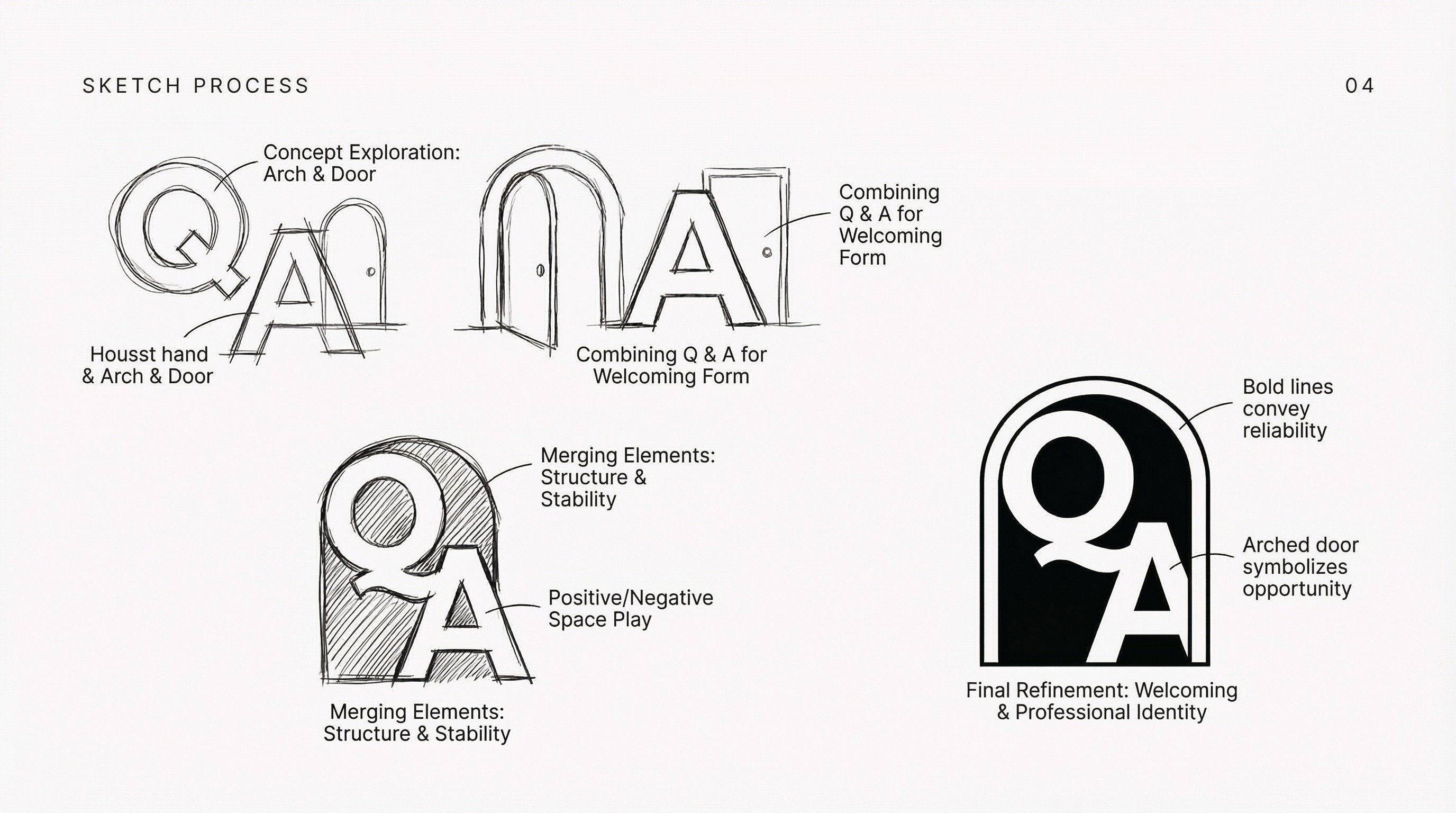
The brand establishes Quinn as a modern, trustworthy professional with clear visual presence. Architectural symbolism communicates real estate expertise while the professional yet approachable aesthetic appeals to contemporary clients. The flexible design system ensures consistent recognition across all touchpoints, distinguishing Quinn in a competitive market while maintaining valuable RE/MAX brand equity.